Flickr
The work I did at Flickr was the most satisfying of my professional life. I was there principally as a designer, but spent a good amount of time in the code, too. Here’s a quick look at three of my larger projects.
Photo page redesign — 2009
The 2009 redesign of Flickr’s photo page remains my most complicated work project, and also my favorite. I got to take on a sprawling redesign of the most important page on our site, and ensure it had consistent vision and quality throughout.
Figure 1 shows the photo page as it looked before I started.
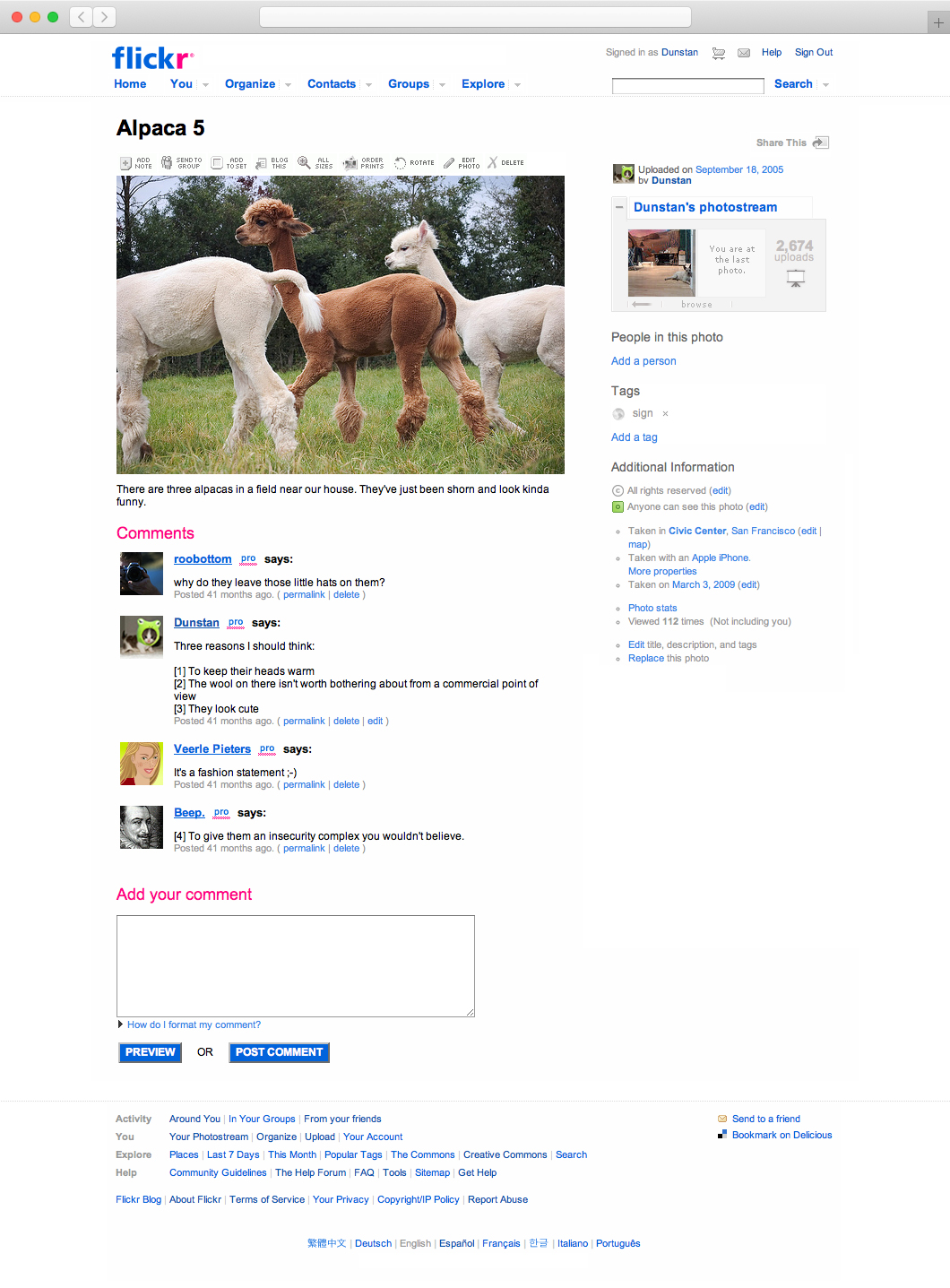
Figure 2 shows the finished redesign. With the exception of the main site navigation every single part of the page was rethought, redesigned, and rebuilt.
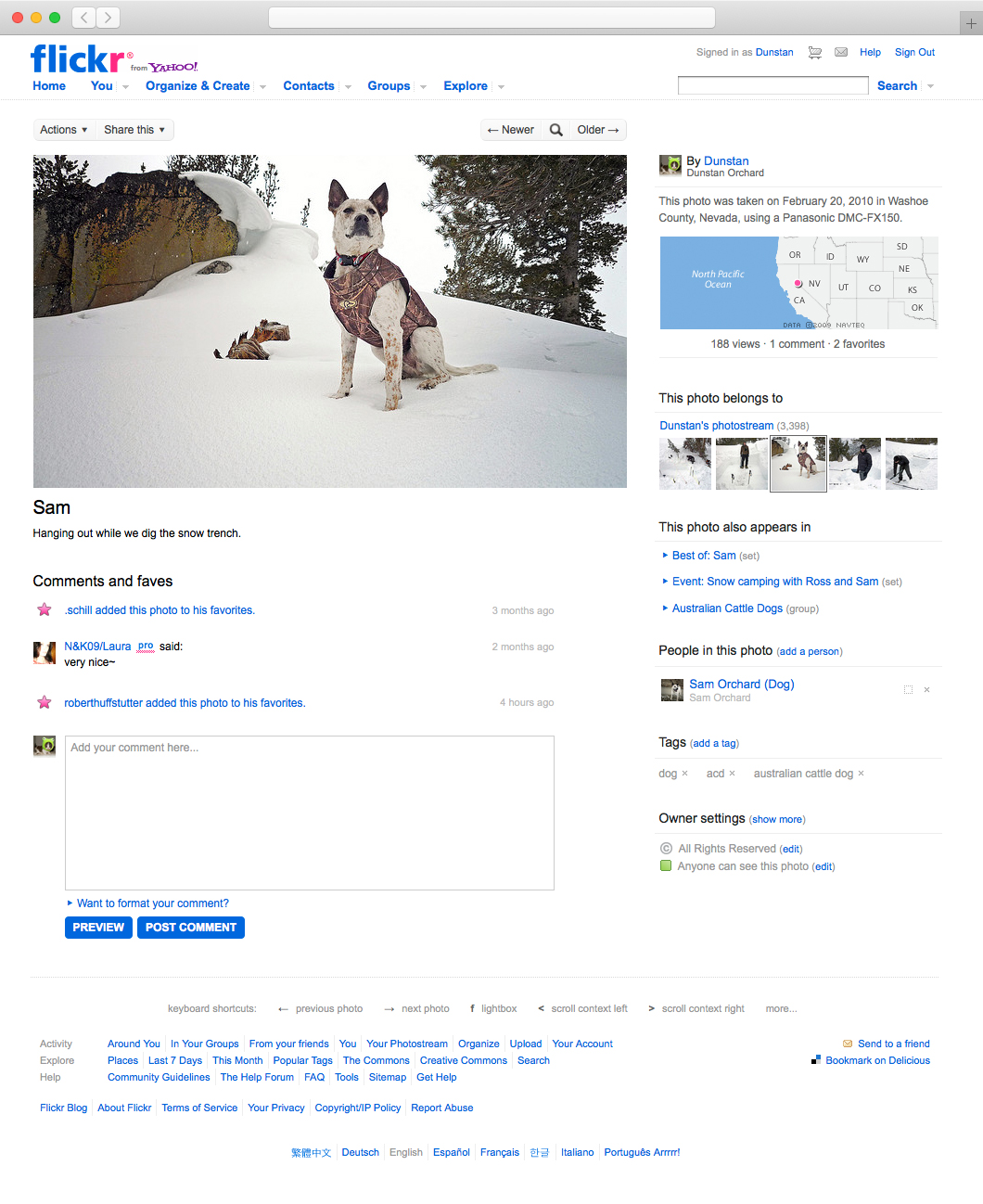
I also redesigned all 51 popups that could be triggered from the photo page (such as photo rotation, ordering prints, adding to a map), and many of the pages that directly related to the photo (such as the photo’s EXIF page, or the galleries it appeared in).

Eleven years later I still remember how much fun this problem was to work on. We had a highly capable team, a product with personality and a strong viewpoint, and a community that kept us honest and engaged. Just a dream.
Mobile site redesign — 2009
In early 2009 I redesigned Flickr’s mobile web site. The first iPhone had been released 18 months before and had quickly changed the public’s idea of how modern mobile sites should look and function. Flickr’s WAP-style site, already a few years old, had been looking more outdated by the day.
The site we built to replace it had a limited feature set but provided a useful, fast, Flickr-like experience that looked at home on the iPhone.
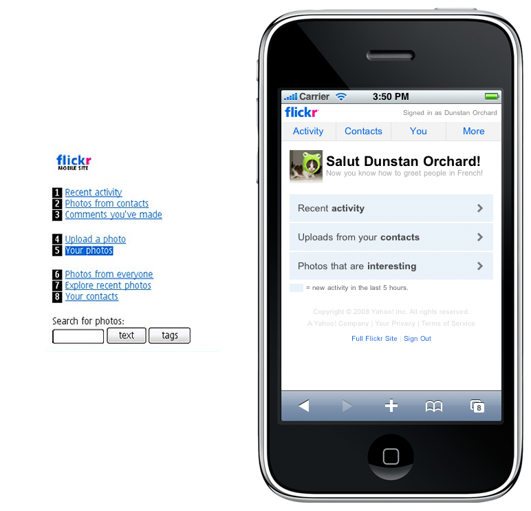
Throughout the build we periodically boiled everything down to as few styles, colors, and components as possible. That not only helped keep the site easy to use and understand, but also made it easy to maintain. Figure 5 shows me tagging common font styles/colors so they could be unified in the code.

The final design rolled out over several small launches and was a great success. For many years it provided a better mobile experience than any of the native iOS Flickr apps, and wasn’t replaced until 2017.
Maybe the best iPhone-optimized web site I’ve seen anywhere.
— John Gruber, Daring Fireball.
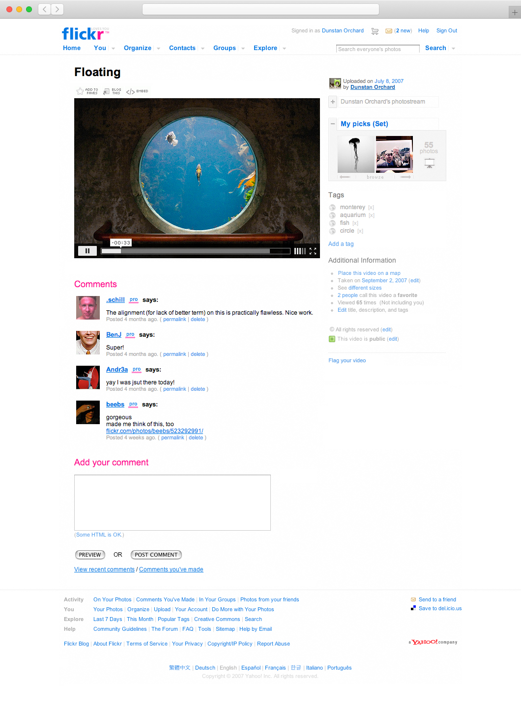
Flickr video — 2008
For the first four years of its life Flickr was strictly a photo sharing site, but in April 2008 we began accepting video uploads too.
In preparation for the change I’d updated the site’s UI and copy so the two media types would happily coexist, and designed a player which fit quietly into the site’s thumbnails and was usable at any size (Figures 6 and 7).
When the project was first announced some of our users were fearful that the site would become polluted with junk videos, but our implementation and the general tone of the site prevented that.
flickr video cleverly extends the value proposition of flickr and does so in an highly appropriate yet pleasantly lighthearted fashion.
— Lane Becker.