Mobile messaging app — Layer
In 2015 I started designing a series of messaging apps for Layer. The designs were simple but thorough, and included the popular messaging features Layer offered — 1-to-1 chat, group chat, typing indicators, delivery and read receipts, attachments, etc.
The apps, along with their source code and design documents, would be published as case studies. They’d be the starting point for many of our customers’ own apps, so it was important they set a good example.
Exposing complexity
This kind of product work benefited from step-by-step walk-throughs, highlighting both expected and unusual interactions. Seeing these flows gave me confidence in the completeness of my designs, and helped the wider team understand the scope of the product.
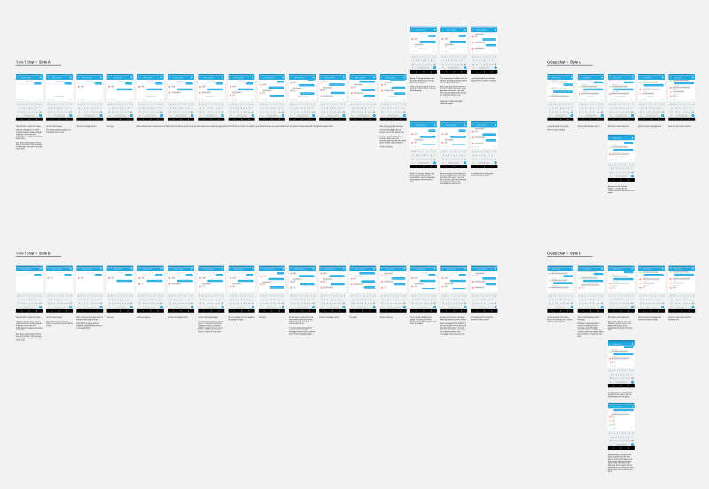
Figure 1 shows the flow diagram for typing indicators. It presents two different designs and explains their behavior in 1-on-1 and group chats.

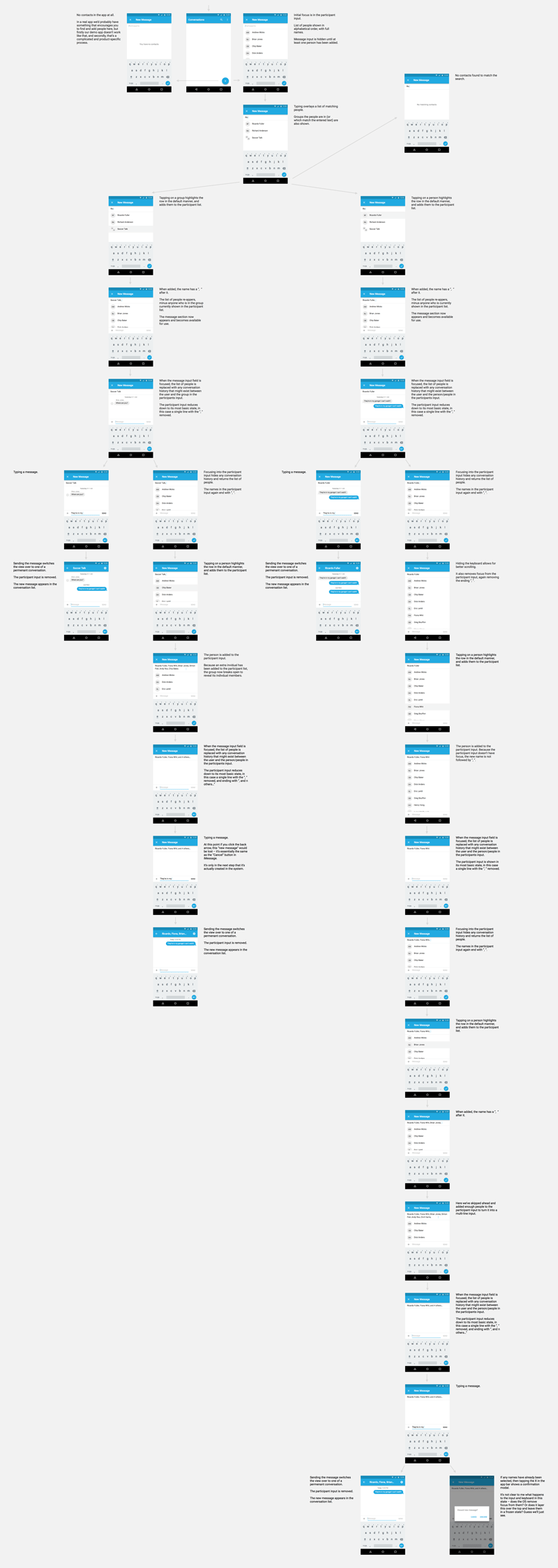
Figure 2 shows the flow diagram for writing a new message. It presents a single design, but again walks through the expected behavior in 1-on-1 and group chats.

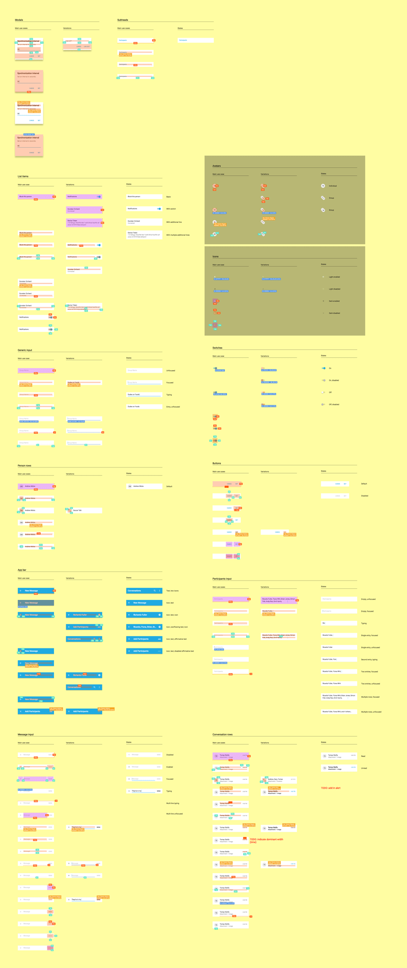
The same approach to exposing complexity was applied to the individual components I used in my designs. The majority of them were taken straight from Material Design, but by speccing them in a separate document (Figure 3) our engineers could be sure of exactly what they had to build and how flexible it needed to be.

Designing the messaging UI
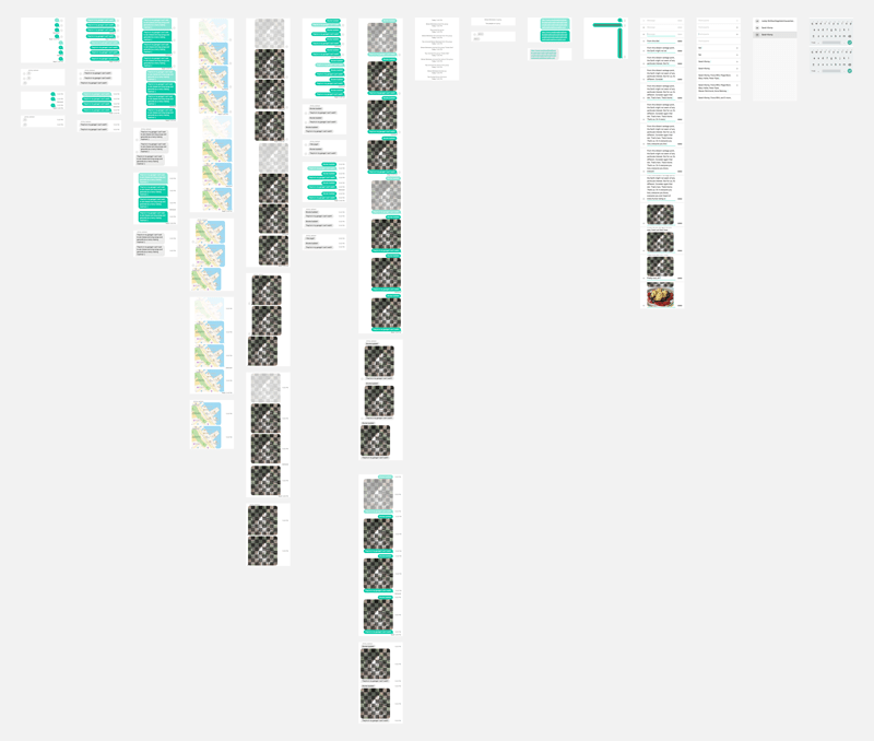
Visually these components had to look at home on all four platforms we were targeting — Android, iOS, watchOS, and the web. They also needed to cover all of Layer’s supported features (attachments, read receipts, typing indicators, etc) and provide for their edge cases (short/long messages, huge/tiny attachments, 20 people typing, etc).
As before, I documented each component in its various states, so that everyone had confidence in what we had to build (Figure 4).
