
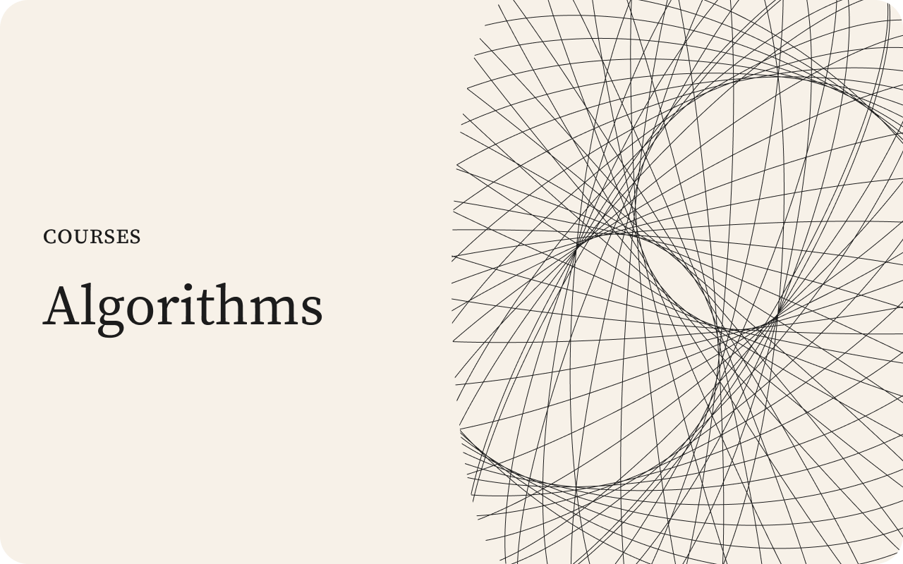
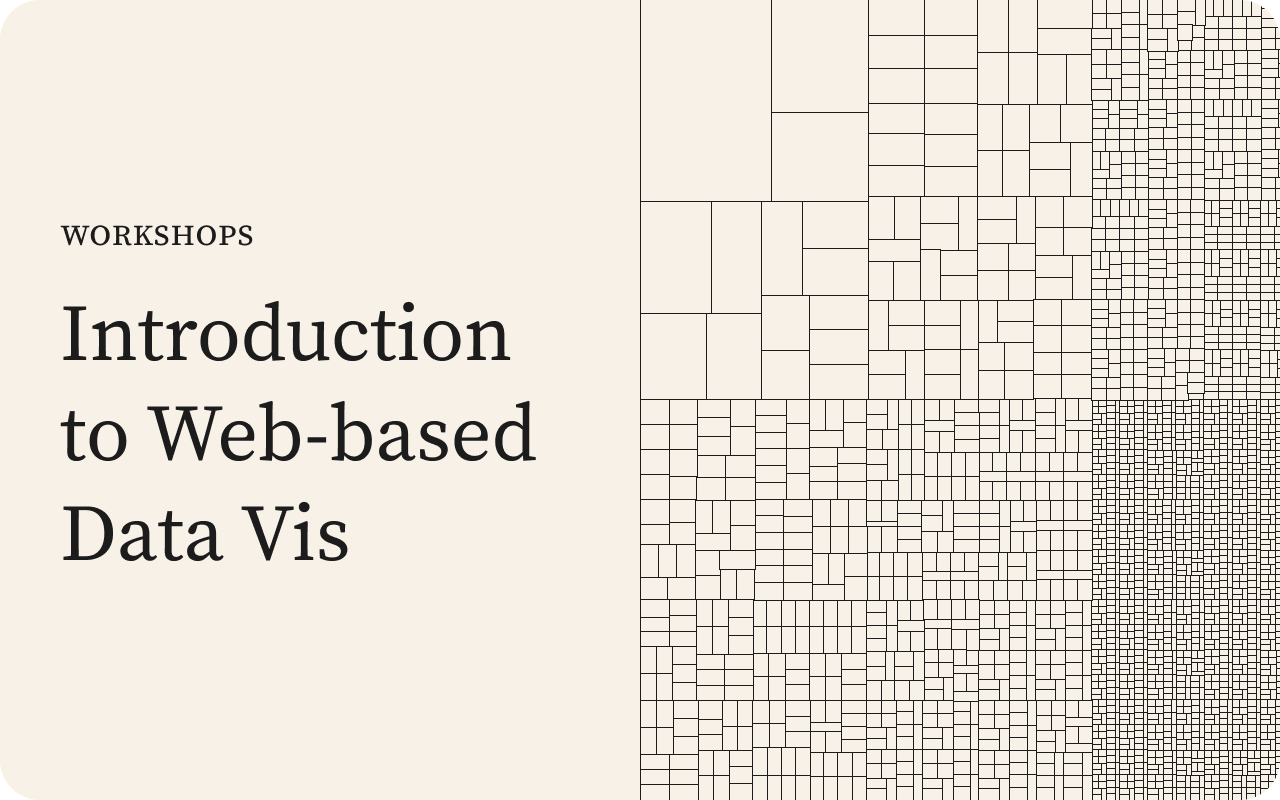
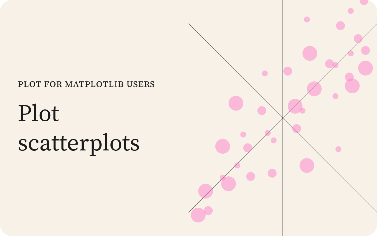
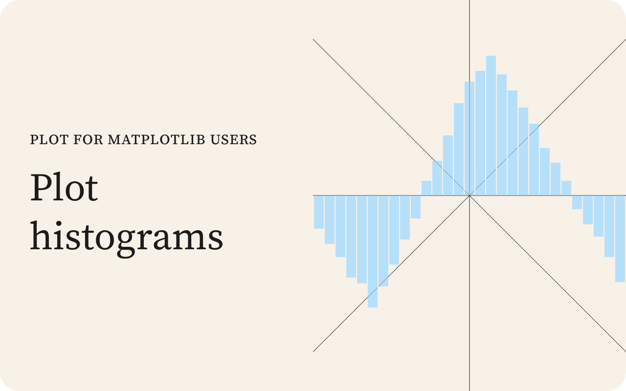
Visual design at Observable
There’s a particular kind of discovery that happens when you expose coded variables as UI — as sliders, color pickers, and toggles. You sweep through ranges you’d never have tried in code. You push two values to extremes at the same time just to see what happens. Some of what emerges is nonsense. Much of it is intriguing. So many possible pathways reveal themselves that it can be hard to decide which one to walk down.
It’s a lot of fun.
I did this kind of work a lot when I was at Observable. Our notebooks made it easy to turn pure code into code + UI, and the community published hundreds of inventive notebooks every month. A steady part of my week was reading through them, looking for ones that could be forked and modified into something beautiful.
When a design brief came in — a marketing image or a product illustration — I’d turn to the collection of notebooks I’d made and scan through them for something suitable. If nothing stood out I’d fall back on more traditional design methods. But whenever possible I favored code-driven imagery for the flowing, beautifully repetitive patterns it could produce.
Flow fields
Figure 1 is an example of this fork-and-modify process. It generates flow fields — vector patterns that follow an underlying force field — and lets you shape them by hand. Try out its presets. Zoom and pan the canvas. Go into edit mode and drag the poles around (double-click to add or delete one). When something looks good, download the SVG and drop it into Figma for further refinement.
This work is a heavily modified version of a community notebook by Tony Chu (who himself took inspiration from the visual artist Tyler Hobbs). The two notebooks only share 120 lines of algorithm code; the remaining 850 lines are original work produced by directing a pair of AI agents.
Tony’s notebook draws flow fields beautifully but doesn’t let you shape them in this way. The exposed controls, the direct manipulation of poles, the panning and zooming, those are all my additions. Under the surface the implementation is also new. Computation runs in a Web Worker, and lines appear progressively, so the page doesn’t freeze while drawing. The renderer batches the final output into a single path, cutting the DOM node count by orders of magnitude.
Figure 2 shows examples of the work I made using an earlier version of this code, along with other designs I created, both programmatically and by hand.


Error pages
Figure 3 shows another piece of work using the same fork-and-modify process — a set of error pages I designed for Observable. The text on the left was specific to the error type (404, 500, under maintenance, etc.), while the image on the right was randomly chosen from the ten I’d produced for the project.
Each image linked back to the notebook that generated it. Viewers could click through and see how it was made, then go on to visit the notebook I’d forked it from. This turned the error page into a learning opportunity, and ultimately an entry point back to the community’s work.
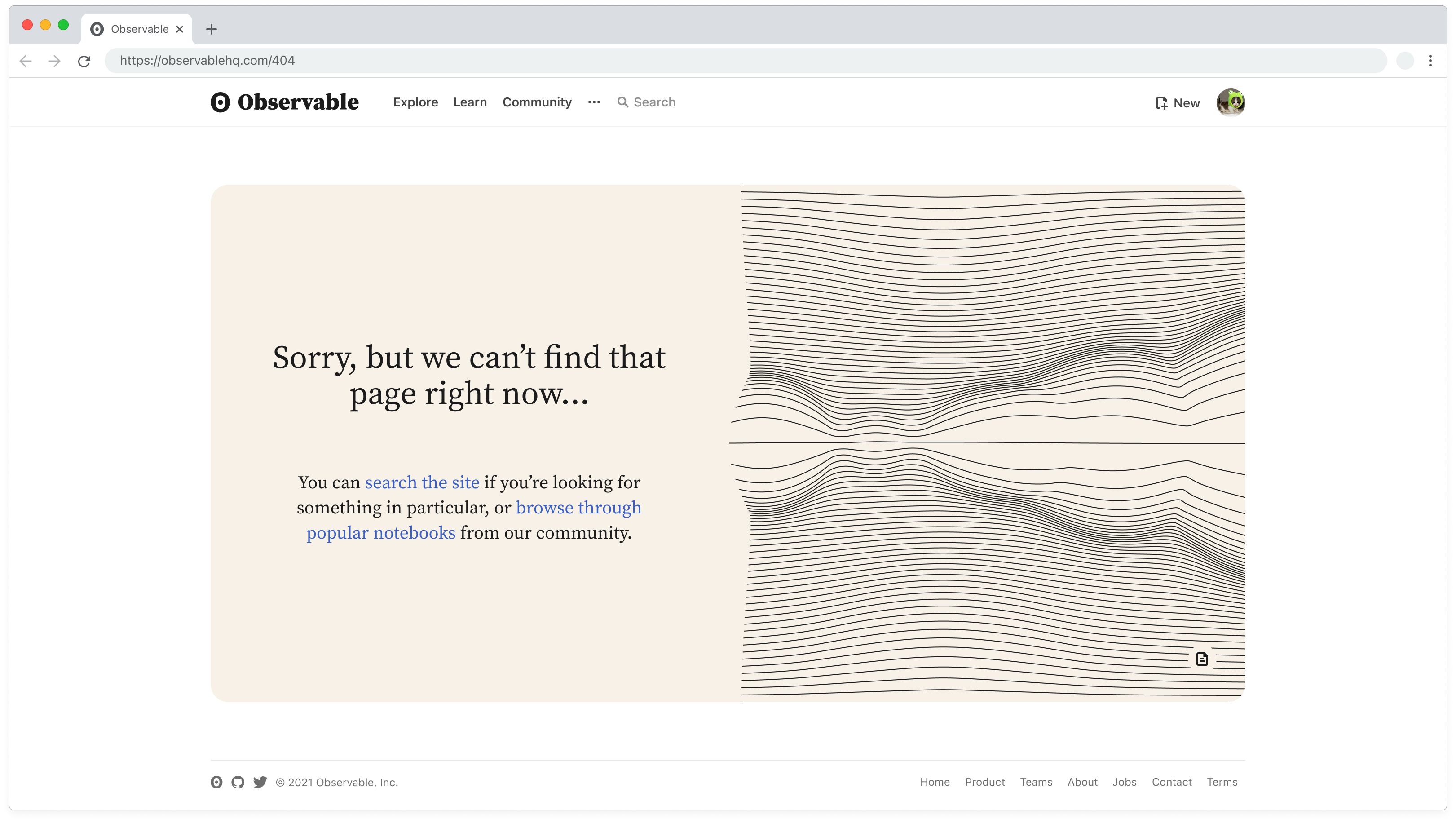
Below are six of those images along with some of their controls. Play around with them and see how far you can push each one.
For a while this is how we did visual design at Observable. I browsed notebooks for promise, forked what looked interesting, and then altered them until they fit the brief. Things changed when we hired a full-time marketing designer, and I went back to building the product.