Rebalancing a UI
I spent most of 2025 designing and building a new product at Observable called Observable Canvases — a collaborative, node-based tool for fearlessly exploring, visualizing, and analyzing data.
Prototyping started with the tldraw SDK, which gave us an infinite canvas as well as a comprehensive set of whiteboarding tools. As a Design team we pulled a face at those whiteboarding tools and planned to remove them before launch. We hadn’t asked for them, and they dominated the UI, to the detriment of our own data-focused features.
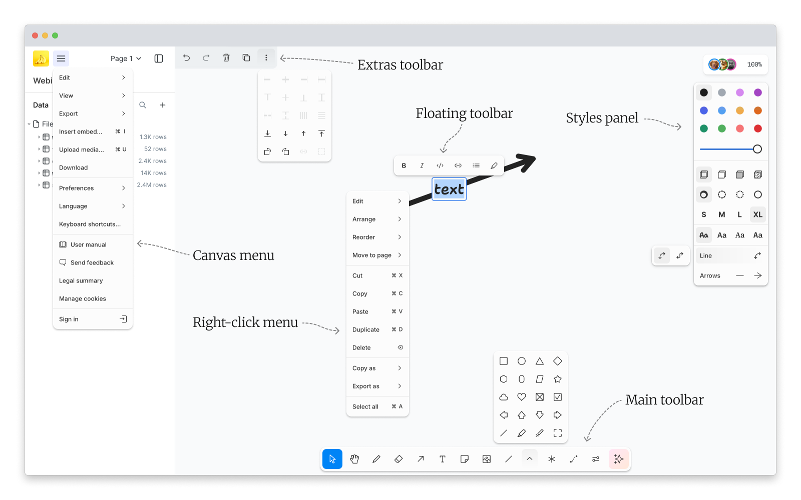
Of particular concern was tldraw’s Styles panel, which covered up the canvas’s content, and the Main toolbar, which was difficult to use with so many tools in it. In one research call I watched a user search for the SQL tool, hovering over each of the first seven buttons to read the tooltips, before giving up and saying I guess there isn’t one
.
Despite all that, we soon realised that users were embracing these tools. No matter how much the tables and charts communicated about a user’s data, almost everyone felt the need to annotate their work with some additional commentary — circling spikes in charts, leaving notes for their co-workers, and summarizing findings for their stakeholders.
We clearly had to adjust our plan: keeping the whiteboarding functions, but improving their form. In doing so we also needed to redress a conceptual imbalance that the tldraw UI had introduced; canvases felt like a whiteboarding tool with some data features added on. We needed it to feel like a data tool with just the right amount of whiteboarding features.
Technically the changes would be straightforward to make, as tldraw is built to be customized. But after twenty-four years of this kind of work I know not to change a system before I understand how it works. Repackaging that UI meant first mapping every part of it.
Breaking down the tldraw UX
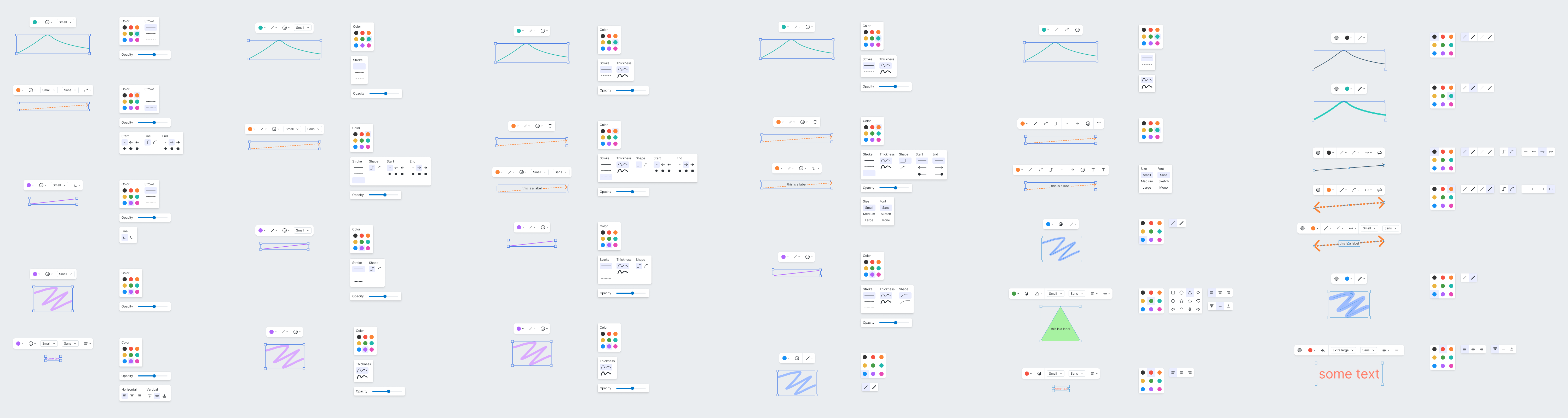
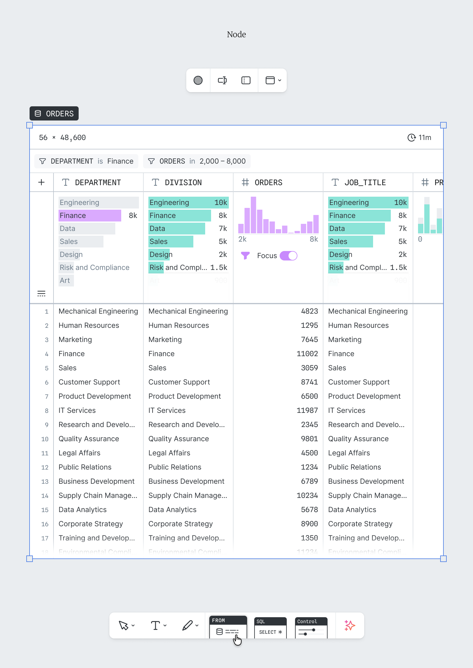
I began by documenting how each of the tools behaved, and in which ways their outputs could be modified by the various canvas controls. The results were the two matrices shown in Figure 4. The first showed which actions could be taken on which objects (and from where), and the second documented UI states for each tool and control source.

This process also surfaced a number of oddities that hadn’t been obvious to any of us, such as tools that seemed similar but behaved differently, or controls that affected more than one property at once (Figure 5). Several of them would require special attention in any redesign.
With a clear view of how the tldraw canvas worked, and the findings shared with my team, I was able to move on to designing a more suitable system.
Rebalancing the UI
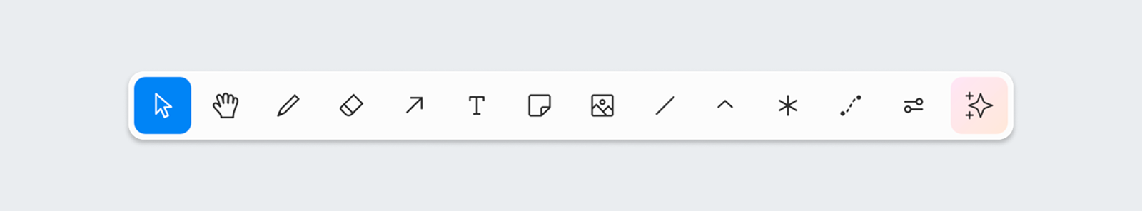
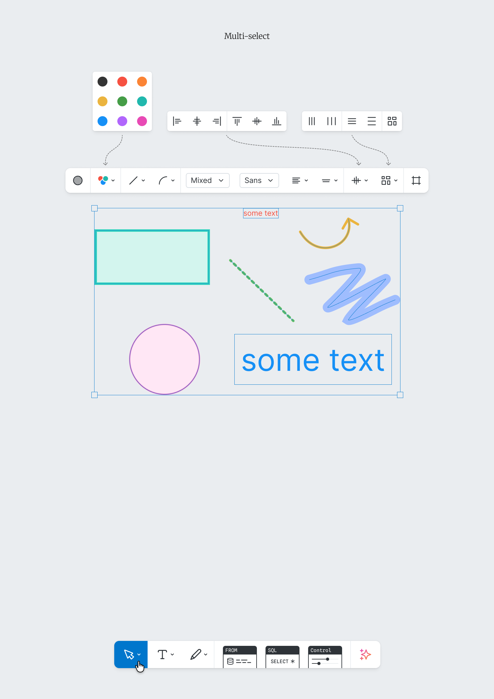
I wanted to bring clarity and contrast to the Main toolbar. This meant fewer initial options, with the emphasis firmly on the data visualization tools. A user should have no trouble finding the SQL tool in the new design.
With the Floating toolbar I had to decide how the options should be grouped and accessed. Figure 7, Option 1 shows a short toolbar with complicated menus. Option 2 shows a longer toolbar, but with very simple menus.
While the idea of a short toolbar was initially appealing, it quickly became apparent that size wasn’t something I should be optimizing for. In every regard the longer toolbar was the better choice — it was easier to build, easier to extend, easier for users to find the control they wanted, and its single-purpose buttons better reflected the current state of the selected object.
The last step was to trim the remaining whiteboarding tools, removing or adjusting anything that wasn’t central to annotating users’ work.
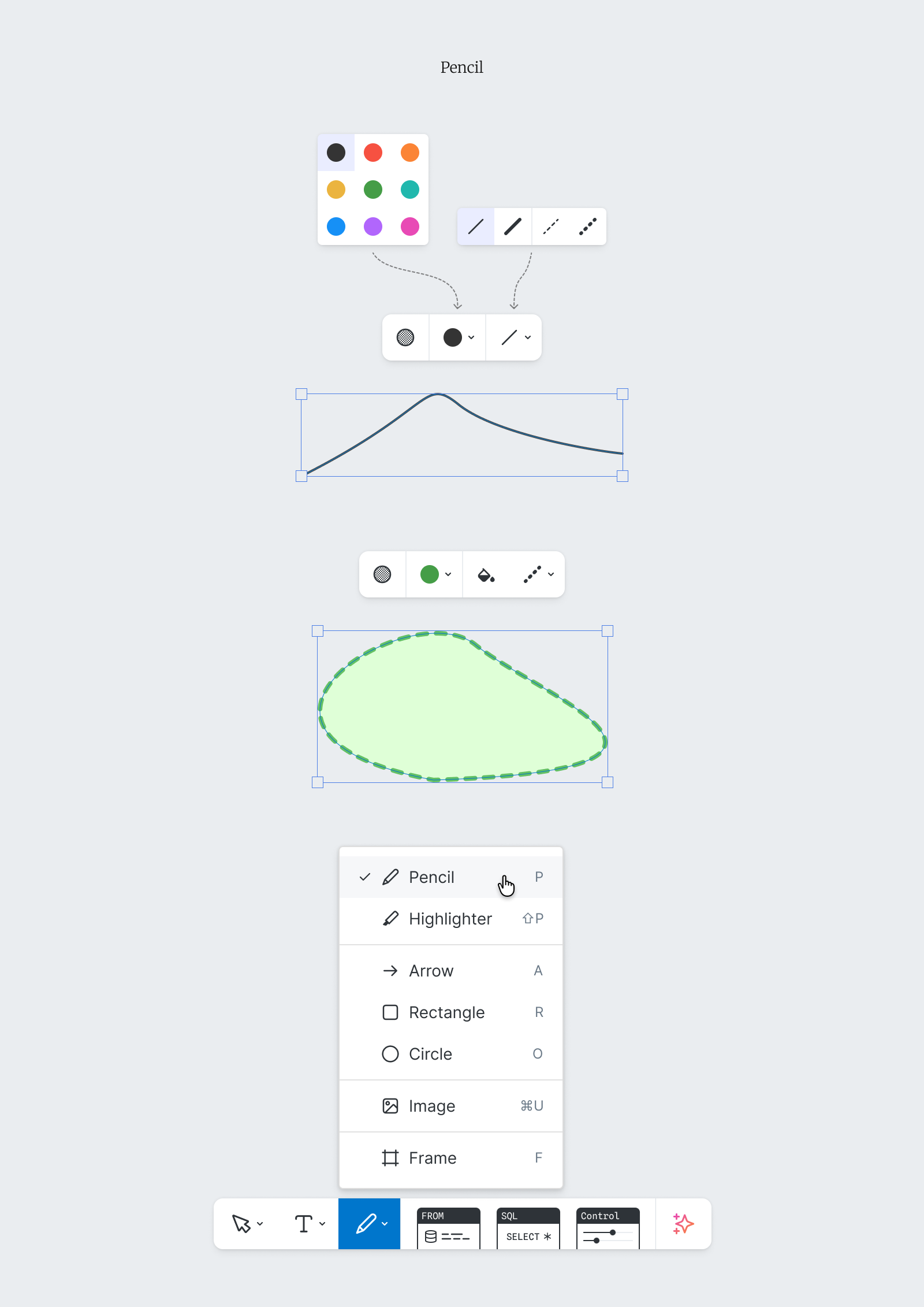
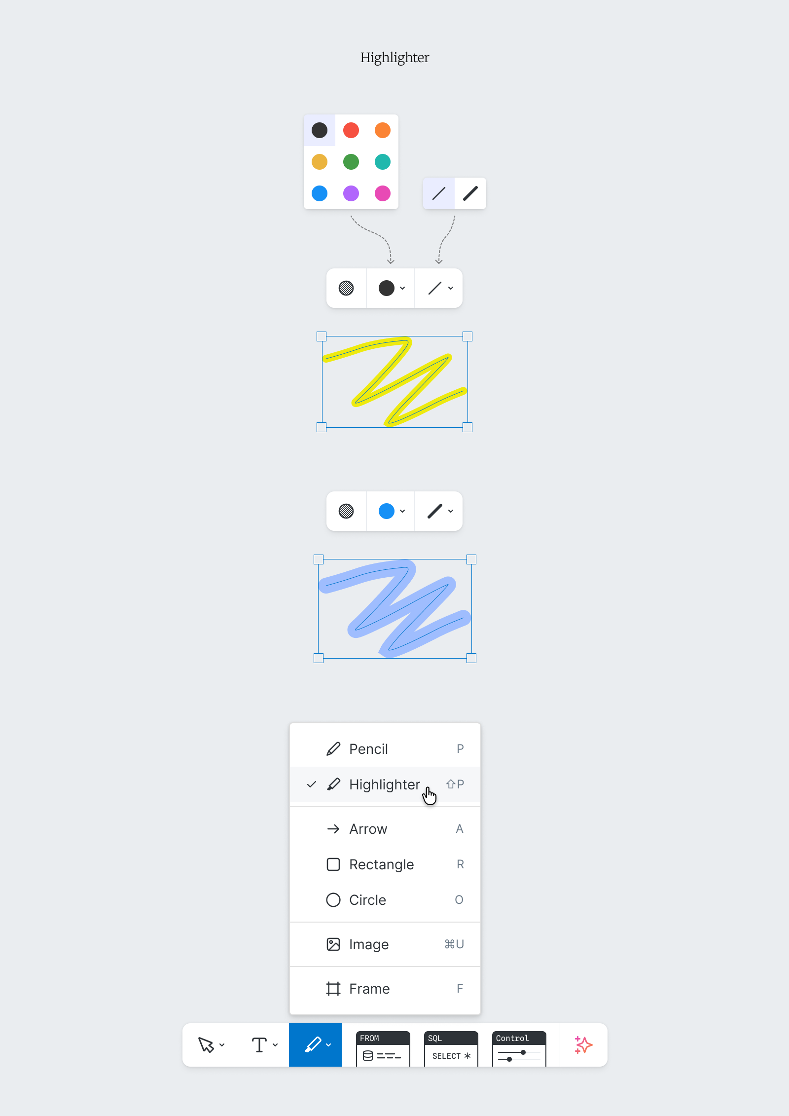
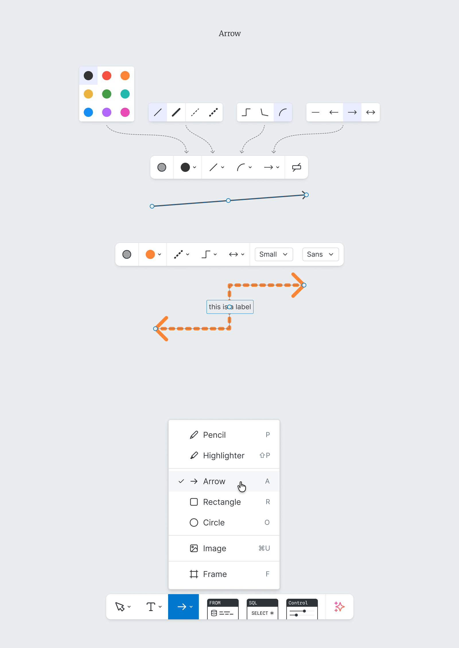
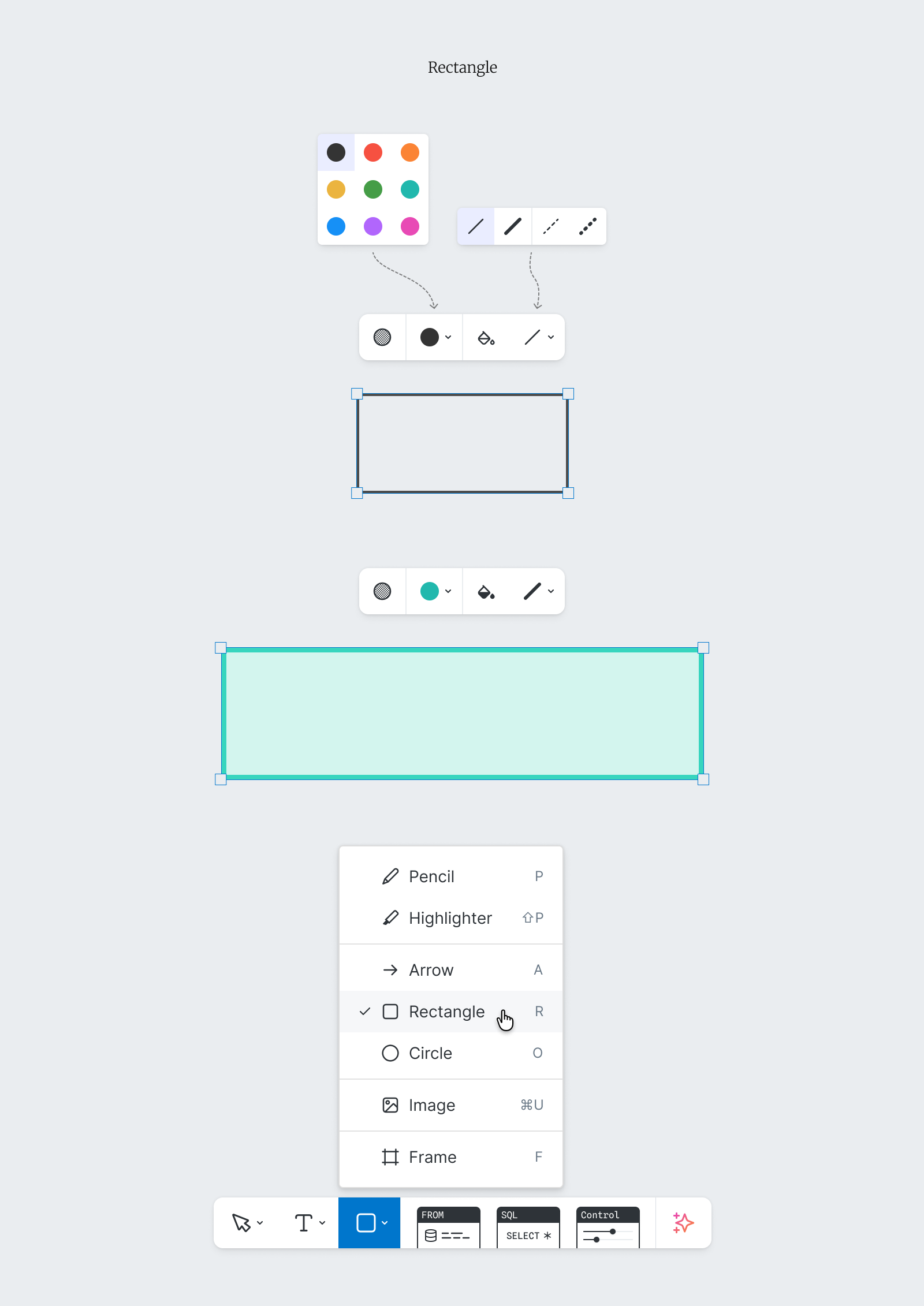
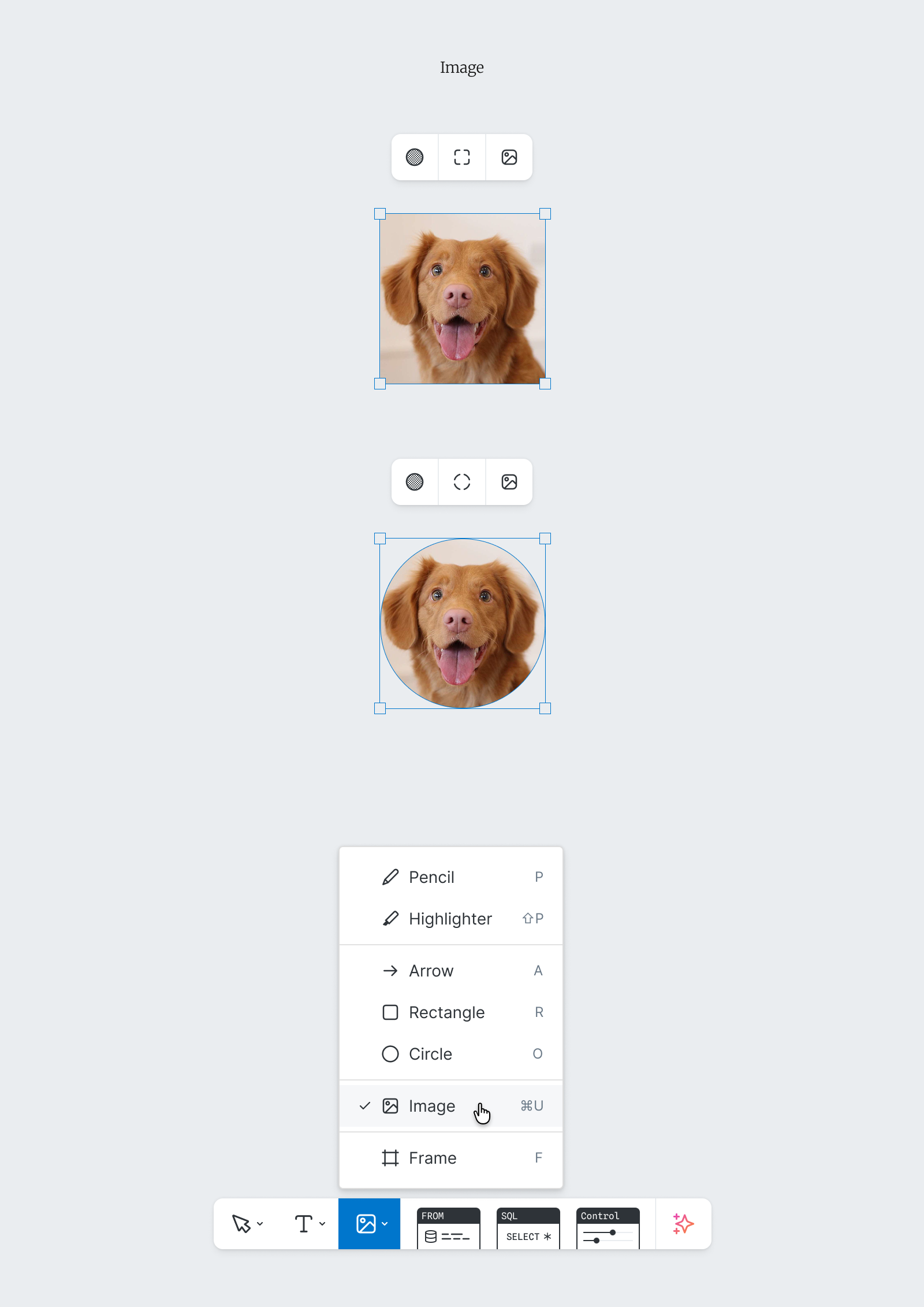
tldraw shipped with 16 shapes, but only the Rectangle and Circle had ever appeared in our users’ canvases, so I removed the rest. The Eraser and Laser tools weren’t needed, so they also went.
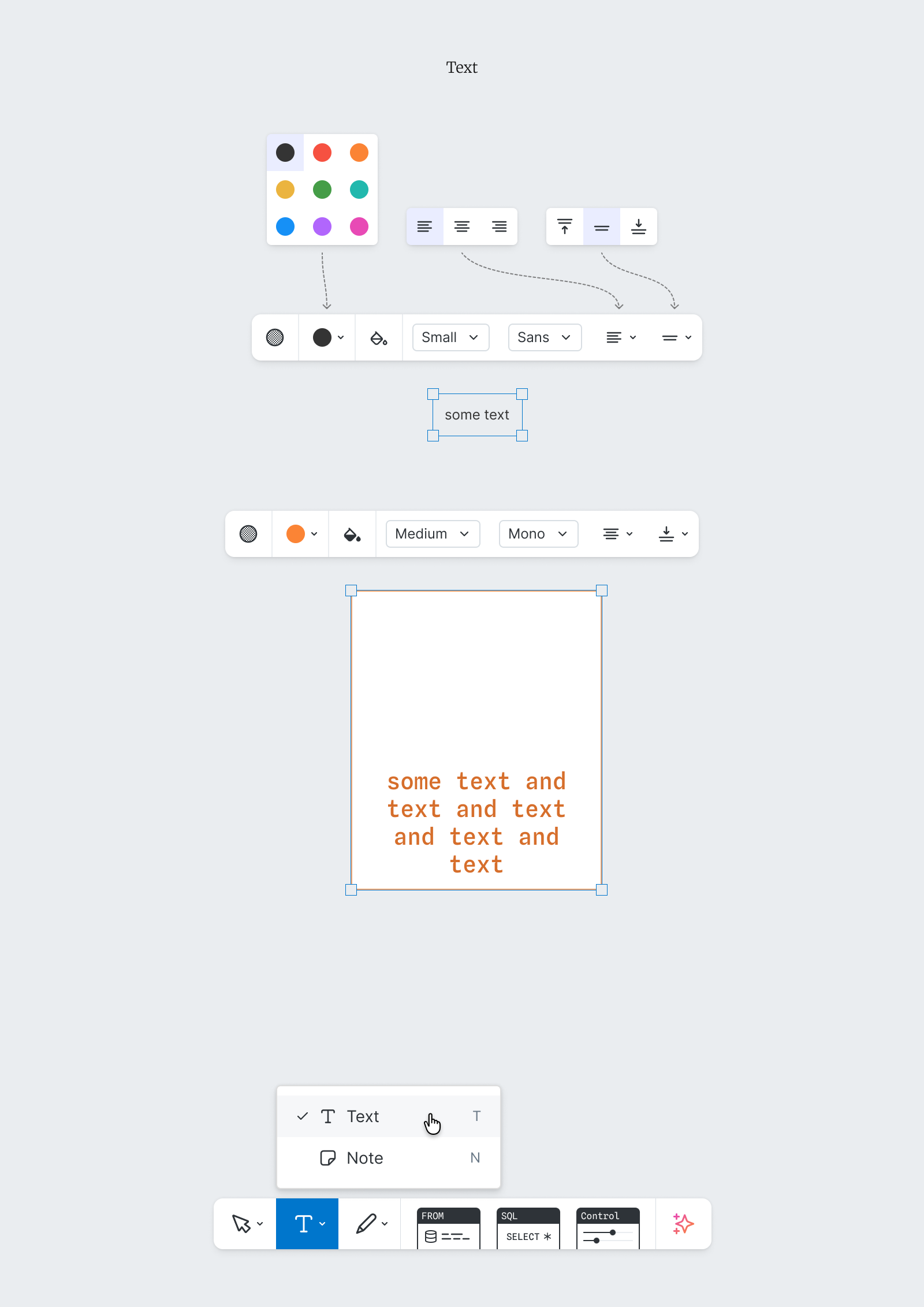
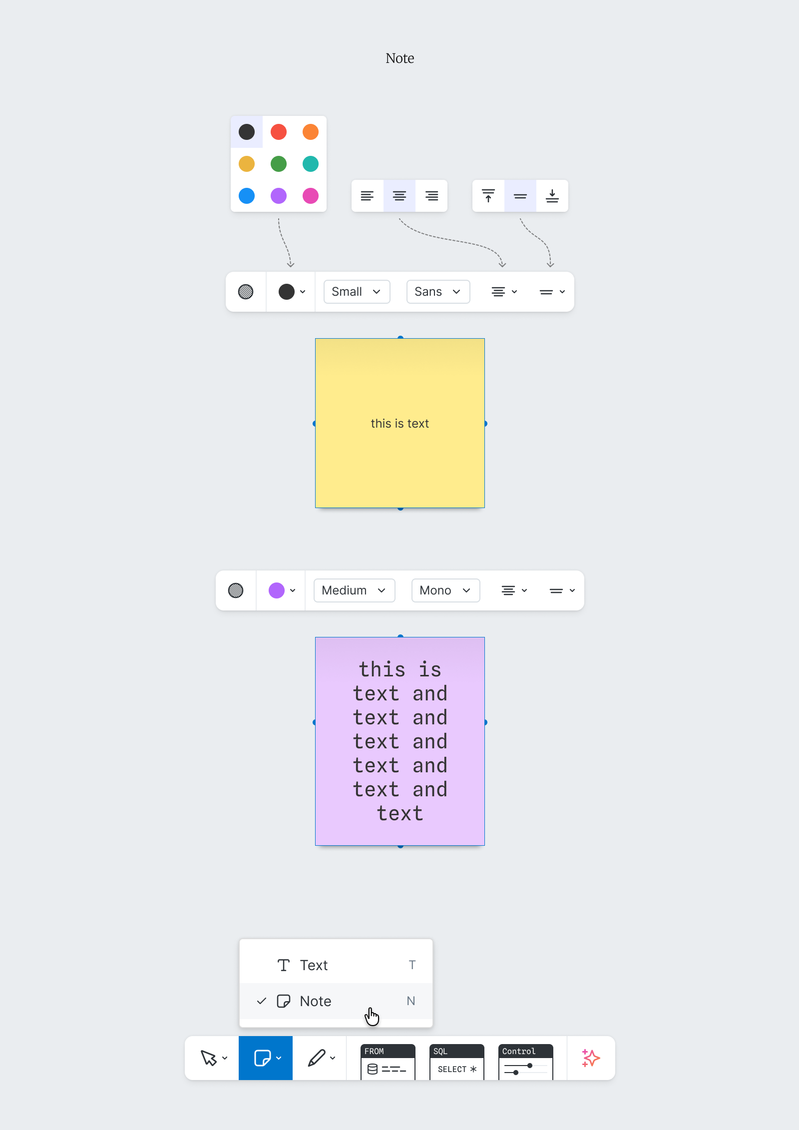
My research had shown some tools doing similar jobs in slightly different ways. The Arrow tool could draw arrows and plain lines, so the Line tool could be removed. The Text, Rectangle, Circle, and Note tools could all display text, but none did it perfectly. I gave the Text tool its missing features, removed text from the Rectangle and Circle tools to leave them purely geometric, and kept the Note tool as it was.
In all we modified three tools, deleted 17 others, and removed the Extras toolbar and Styles panel, reclaiming valuable screen real estate.
The finished designs
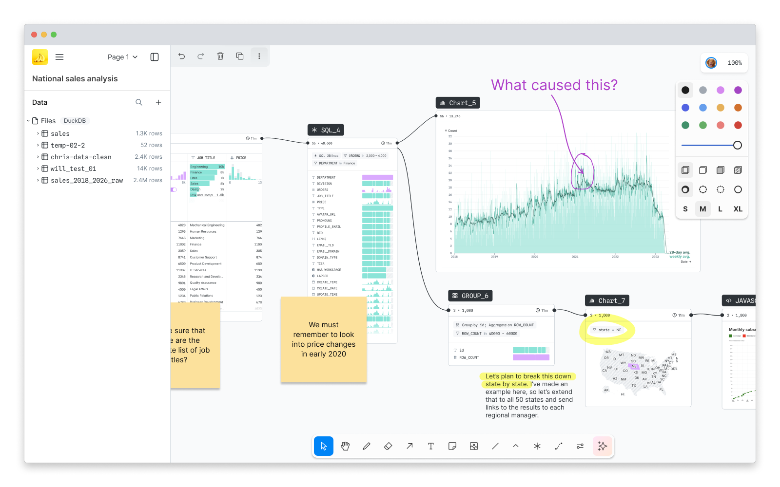
The finished work (Figure 8) achieved the goals of the project: just the right amount of whiteboarding features, in a less intrusive form, with data tools front and center. And because each piece extended a component tldraw already had, engineering was able to build it out quickly.
A quick note on how this UI actually behaved, since the examples above show several states at once. In the finished design, the Floating toolbar appeared only when an object was selected, showing the tools for that object and, wherever possible, reflecting its current state; menus opened beneath the buttons that triggered them.
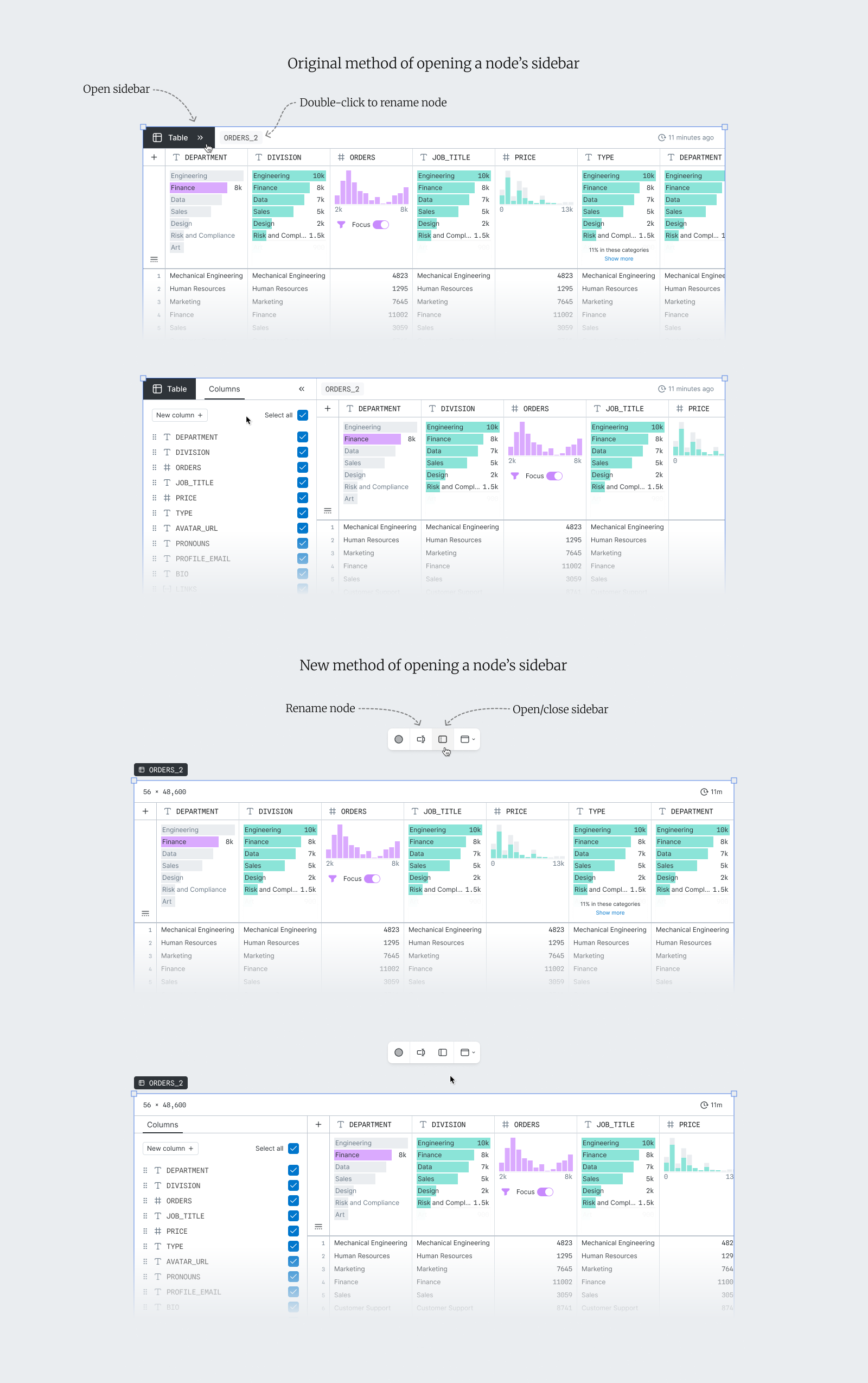
And finally, though the Floating toolbar had come to us as a whiteboarding component, I’d extended it to be a more general piece of the product’s UI. Functions that had been buried inside data nodes — renaming a node or toggling its sidebar — now lived there too (Figure 9).
All of this was made possible by the work that came at the start. Mapping tldraw’s UX in full — every tool, every state, every oddity — was what let me rebuild it with confidence, rather than discovering the system’s real shape halfway through.